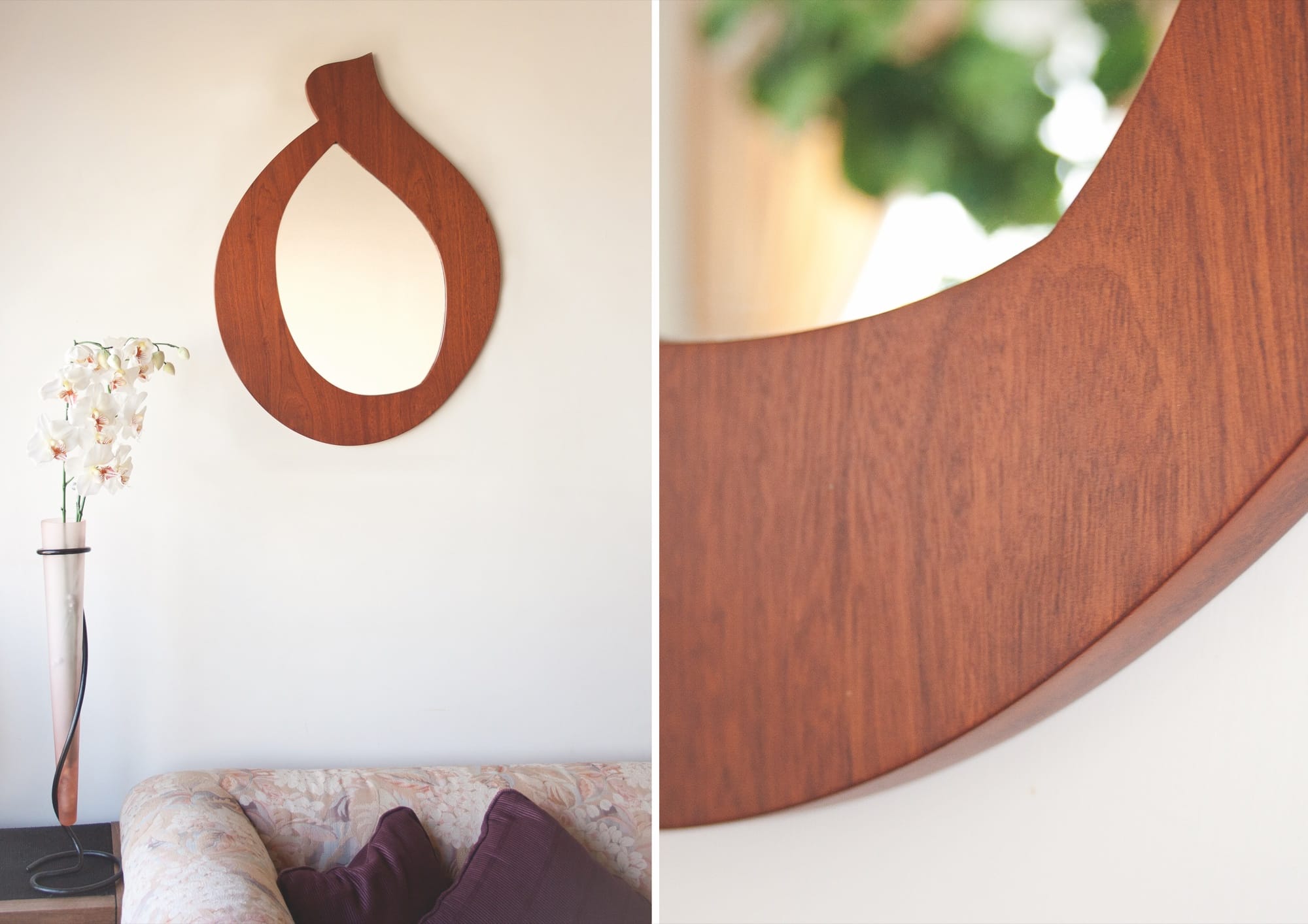
Normally, furniture is meant to be used. Sitting, lying down, eating, and reading are all activities that fix us to our furnishings. Now, they can be read, as well. Kashida Design’s recliners, mirrors, stools, tables and yes, even tissue boxes, are all legible, every item representing a single letter or a word. So you can look into a ‘heh’-shaped mirror, relax on a ‘meem’ lounge chair or pick a book from a ‘helem’ shelf – ‘dream’ in Arabic.
Founded by Mirna Hamady and Elie Abou Jamra just a few years after graduating as graphic designers from the American University of Beirut, ‘Kashida’ is the extension or ‘bridge’ between two letters in a word, connecting them.
When you meet the team, it will probably be in their office, where they have few items on show. Fresh, having launched just five months ago, after leaving full-time jobs as graphic designers, they began online, Hamady reveals, “in order to test the market” but already, they are being sold in design boutiques like Blak & Co. in Beirut, O de Rose in Dubai and Tanween in Jeddah.
Mostly self-funded, Kashida received some initial support from a few outside sources: Doha’s design conference, Tasmeem and Tripoli’s Maurice Fadel Prize and got added international boost when they were featured in graphic design bible Communication Arts Journal’s annual typography competition.
“You often see Arabic type in two dimensions,” Elie explains, “as if it is being used only digitally by designers or in print.” Born of a passion for the language, Kashida’s designs aim to add a third dimension to Arabic, without “transliterating it into Latin, the way it is being employed in the global media,” he continues. “I wanted to see the Arabic letter in larger than life-size.”
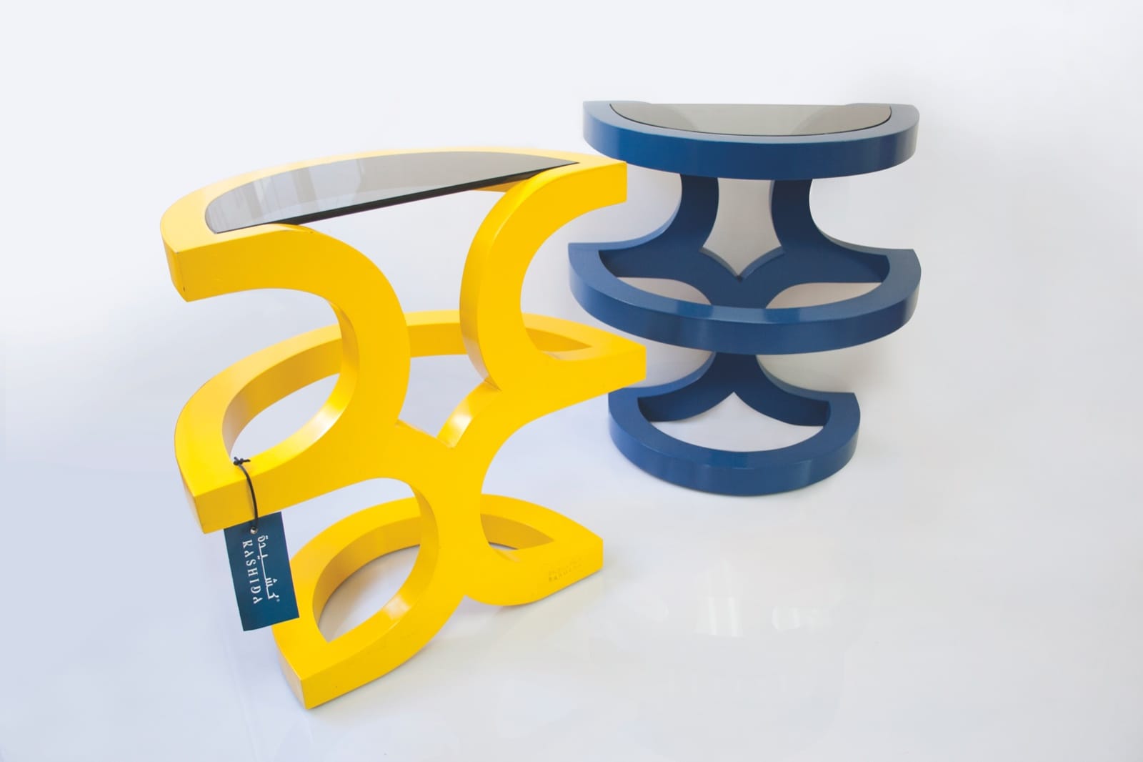
After researching the different typographic design styles available, Mirna says they set about “creating pieces that are functional, merged with our knowledge of Arabic script.” The typography Kashida employs often verges on the experimental. Bold and geometric in outline, almost cubic at times and, of course, stripped of the “tashkil”, the diacritics used as phonetic guides to accentuate certain sounds, when words are ‘made’, their appearance is clean and uncluttered and their affinity to Kufic style is obvious.
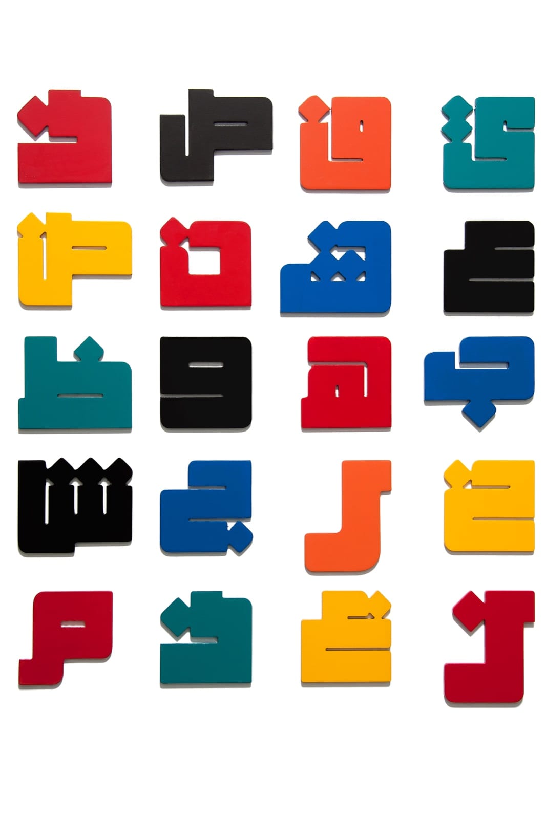
In Arabic, the letter that determines the resulting form. It is not ornament, which does complicate their designs. “The proportions need to be exactly right so that the letter can be read,” Elie says. Still, some of their objects require a bit of a stretch. For instance in the ‘Ayn’ table, which looks initially more like an intricate infinity sign and as for the ‘Iqra’ in Kashida’s latest stainless steel magazine rack, you need to search for it. With a repertoire of 29 Arabic letters and at least 9 calligraphic styles to play with, Kashida’s possibilities are almost endless. Take your word and sit on it.